A picture is worth a thousand words, but a poorly designed chart can be worth a thousand misunderstandings. Let's explore how to create visualizations that actually communicate.
The Golden Rule: Know Your Audience
Before choosing a chart type, ask yourself:
- Who will view this?
- What decision will they make?
- What's their data literacy level?
Executive dashboards need different visualizations than analyst reports.
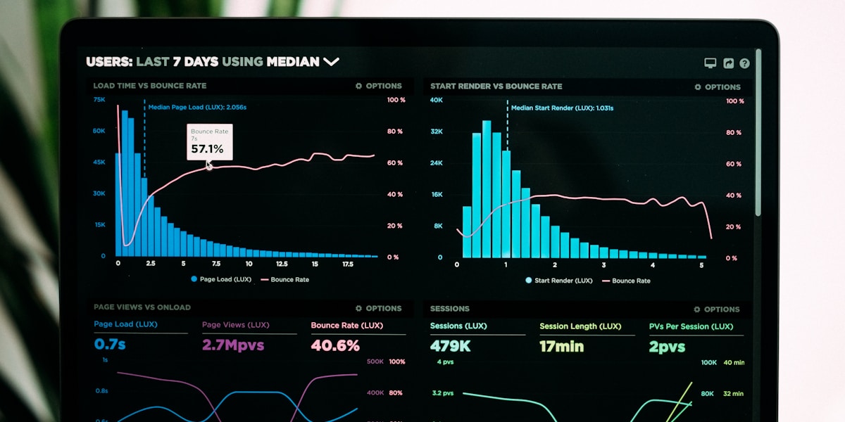
Choosing the Right Chart Type
Line Charts - For Trends Over Time
Perfect for showing:
- Sales growth month-over-month
- Website traffic trends
- Stock prices
Bar Charts - For Comparisons
Best for:
- Comparing values across categories
- Top 10 products by revenue
- Regional performance
Pro tip: Keep bars horizontal for long category names.
Pie Charts - Use Sparingly
Only use pie charts when:
- You have 5 or fewer slices
- Parts truly add up to a whole
- Proportions are significantly different
Otherwise, use a bar chart instead.
Design Principles
1. Remove Clutter
Every element should have a purpose:
- Remove unnecessary gridlines
- Eliminate 3D effects
- Reduce decoration
2. Use Color Intentionally
/* Good color usage example */
.positive { color: #22c55e; } /* Green for growth */
.negative { color: #ef4444; } /* Red for decline */
.neutral { color: #6b7280; } /* Gray for neutral */
Color should:
- Highlight important data
- Show relationships
- Remain accessible (check contrast ratios)
3. Start Your Y-Axis at Zero
For bar charts especially, starting at zero prevents misleading comparisons. Breaking this rule can exaggerate differences.
Common Mistakes to Avoid
| Mistake | Fix | |---------|-----| | Too many colors | Limit to 3-5 colors max | | Missing labels | Always label axes and units | | Unclear title | Use descriptive, action-oriented titles | | 3D effects | Stick to 2D for clarity | | Too much data | Show top insights, link to details |
The Data-Ink Ratio
Every drop of "ink" should represent data. If it doesn't add information, remove it:
- ❌ Heavy gridlines
- ❌ Chart borders
- ❌ Redundant legends
- ✅ Clean, minimal design
- ✅ Focus on the data
Responsive Design Matters
Your charts should work on:
- Desktop monitors
- Tablets
- Mobile phones
Test your visualizations on multiple screen sizes.
Conclusion
Great data visualization is about clarity, not complexity. The best chart is the one your audience understands instantly.
Start with these principles, and your data will finally tell the story it deserves to tell.